When I close my eyes and picture Clarendon I immediately think of wood. I see the wood grain in the inked letters of old wanted posters, I see signs on wooden posts guiding me through a forest and wooden blocks with multi-colored letters and numbers carved into them.
When I see Clarendon used in the world I don't necessarily picture myself in a forest or playing with blocks, but I do get feelings of warmth and hand-craftsmanship and with that comes a comforting timelessness. Even with its ability to demand attention, it does so in a gentle way that does not alarm, but speaks to you in a firm and loving voice.
This is the great success of Clarendon.
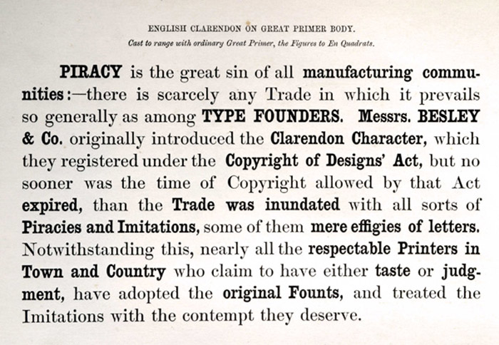
Clarendon is a wonderful example of a class of Slab Serifs called Ionic or Egyptian. Though Clarendon itself was created by Robert Besley in 1845 it is inspired by the typeface Antique, one of the original slab serifs. While Clarendon and Antique share a similar flavor, Clarendon's addition of bracketed serifs, the gentile curves connecting the serif to the body of the letter, gives it the ability to work better inline of a body of text with other serifed fonts as well as giving it its softer and more approachable feel. It quickly became one of the most popular typefaces of its time period and to the point where today we rather quickly associate it with turn of the century England and in the U.S., the old west.
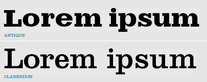
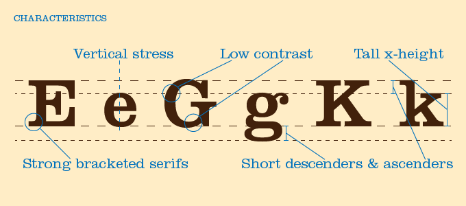
While Clarendon's very commonly used as a headline font, despite its origins as a text font, its modern redrawings from today's type designers have given Clarendon a far more balanced use between body type, italics and headlines alike. Like other slab serifs it has strong squared serifs but with an added softness from the curved brackets and has a low contrast, the difference in width between the thicker and thinner parts of the letterform. These features are part of what gives Clarendon its strength, they are why it gives off feelings of importance and substance. They make it a typeface that is hard to ignore.
The way to truly understand animals is to study them in the wild, the same idea helps to better understand a typeface as well. By looking at how it is used we can gain a better understanding of both how to use it, as well as what situations it will be smart to use it in. The images below show some of Clarendon's most popular uses and in most of them we can really see the warmth that it brings to the table. From its use in the National Parks Department to wooden children's blocks to Starbucks and Wells Fargo's identity, we can see how it has come to be associated with nature and natural products as well as the old west.

The purpose of these posts is to ignite a curiosity to discover what typefaces can bring to what you are working on. By having a little information behind who it is, where it came from and how its used, you can hopefully choose a typeface that better reflects what you want to express.
Many type foundries carry their own variations of Clarendon. Listed here are some wonderful typefaces inspired by Clarendon and the other 1800's slab serifs: