Garamond is Michelangelo's David to the type world. It is a timeless masterpiece created by a classical craftsman and to this day is a cherished piece of history. Even in today's digital forms, Garamond evokes the hand. It puckers and bloats in delicate ways like ink swelling within paper fibers. Reading its beautifully imperfect letters feels like reading a renaissance manuscript. It is elegant while never feeling overly ornate or showy.
Classic and classy, Garamond has maintained a high level of admiration and continued use that is very unlikely since it pre-dates all other typefaces. Like David, Garamond came quietly into the world yet has been a marker to which everything that has come after it is measured.
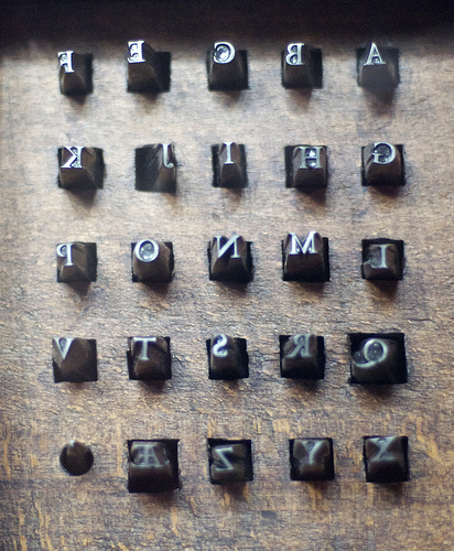
Named for the French punch-cutter Claude Garamond, the typeface in its current form has a foggy past. What we now know as Garamond are modern interpretations of fonts that were inspired by drawings which were modeled after the punches of Claude Garamond. The original punches, long slender metal rectangles with individual letterforms carved into the ends, were finely-tuned and perfected during the early to mid 1500’s up until Claude’s death in 1561. After his death, sets of his punches found their way into the hands of foundries and served as inspirations for many different typefaces in addition to the many variations of Garamond. It should also be said that not all of the Garamond’s in the world are the same. Some are modern interpretations, some are recreations of typefaces from the late 1500’s modeled after the original punches and a few are faithful modern recreations based on the original punches.
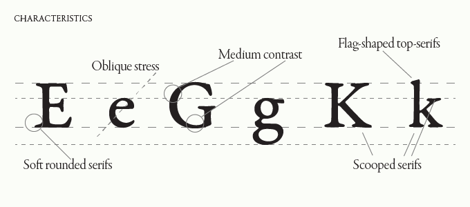
While seeing the differences between many of the old-style typefaces today can be hard for the untrained eye, it is important to note the true significance of Claude Garamond’s place in the history of type. Prior to Garamond’s work, the practice of making type was to make as exact as possible replicas of a scribe’s handwriting. Garamond was the first to craft letters to the medium. He was the first to deviate from a purely handwritten-style to make letters that would read better when printed. These letterforms were thinner and more delicate than those before it, which both allowed the ink to bleed on the page without overly distorting the words and used less ink. They also were more decorative than those modeled directly from the hand. The capital T is a beautiful example of a letterform that is far more ornate than a scribe would write but Claude styled with unique semi-parallel angled serifs. Other key characteristics include the way the top serifs of the lower-case letters curve back into the letter, the feeling of airyness from the generous openings in the letters, known as counters, and the tall ascenders. But when in doubt, you can always look for the tell-tale crossed capital W.
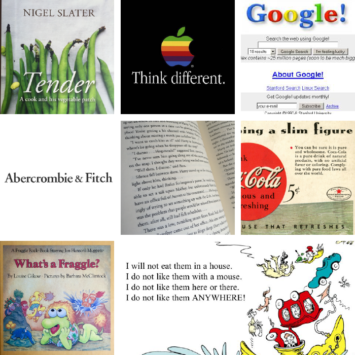
Garamond truly lives on paper, so it is unsurprising that you find it quite often in books. Some of the most popular books have been set in a form of Garamond including the books of Dr. Seuss and all of the Harry Potter novels in addition to many book covers. A few other notable uses include Google’s original logo, Abercrombie & Fitch’s logo and Apple’s Think Different campaign.
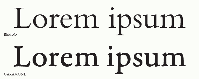
While Garamond is often the go-to in Old-Style serif typefaces, there are many others that provide a similar overall aesthetic. Bembo, Jannon & Caslon are all beautiful variations of the Old-Style serifs.
As discussed earlier, there are many different variations of Garamond depending on who made them as well as who inspired them. Below are a few examples of the most common Garamond typefaces: